Assignment 1
Assignment 1
1. Anscombe’s Examples
Try Anscombe’s examples.
I tried Anscombe’s examples and I found them to be very interesting. I thought it was very cool how the data was so different but the predictive line was the same. I think it isimportat to plot your data or at least do some extensive EDA before making any assumptions.
2. Generative Art
Google “generative art”. Cite some examples.
I found several artists who do generative art like Ben Kovach and Tyler Hobbs. Their stuff was very unique and I enjoyed looking at their work. I also found a website called “Artbreeder” which is a generative art website that allows you to create your own art. I thought it was very cool and I enjoyed playing around with it.
3. Run Fall.R Script
Run the Fall.R script.
I executed the script and generated the following plot:

I thought the plot was very unique and I wanted it to reflect a maple color as that is what I grew up with in the fall. I think the plot is very well done and I am happy with the results.
4. Chart Critique
Write a critque on a chart in published work.
I critiqued the following chart:
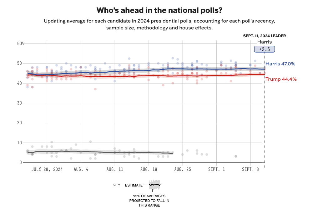
This chart was from fivethirtyeight of ABC News and I thought it was very well done. One thing I do have to say about it is that I wish that it had more clearly labeled the average current percentage of popularity for each candidate. I think that a note for Kennedy’s popularity would have been helpful as well. I think that the chart is very informative and that it cited its sources very well afterwards bringing in an aggregate of polls in order to create this visualization.
Enjoy Reading This Article?
Here are some more articles you might like to read next: