Assignment 2
Assignment 2
Murrell’s R Graphics
plot(): Used to create the basic plot. lines(): Adds lines to an existing plot. points(): Adds points to an existing plot. axis(): Customizes the axes. box(): Adds a box around the plot. text(): Adds text labels to the plot. mtext(): Adds text in the margins of the plot. hist(): Creates a histogram. boxplot(): Creates a boxplot. legend(): Adds a legend to the plot. persp(): Creates a 3D perspective plot. names(): Labels elements in the plot. pie(): Creates a pie chart.
Base R Plotting
We start by plotting basic lines using base R functions.
plot(1:10, type = "o", col = "blue", xlab = "X Axis", ylab = "Y Axis", main = "Basic Line Plot")
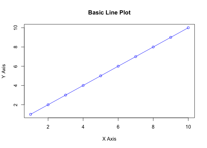
This generates a simple line plot with points overlaid. The type = “o” argument ensures both lines and points are displayed.
Working with Grid Graphics
The grid package offers more flexibility for creating complex layouts. Here’s how to draw a rectangle and customize its appearance.
library(grid)

# Create a rectangle using grid graphics
grid.newpage()
grid.rect(width = 0.5, height = 0.5, gp = gpar(fill = "lightblue", col = "darkblue"))

This creates a rectangle centered in the plotting area. The gp parameter allows you to specify graphical parameters such as fill and col.
Working with HappyPlanetIndex Data
# Load required libraries
library(readxl)

# Load the Happy Planet Index data
hp_data <- read_excel("HPI2021.xlsx")

# Preview the dataset
head(hp_data)
## # A tibble: 6 × 6
## Rank Country `Life expectancy (Years)` Wellbeing Carbon footprint (tCO2…¹
## <dbl> <chr> <dbl> <dbl> <dbl>
## 1 1 Vanuatu 70.4 7.1 2.62
## 2 2 Sweden 83 7.4 8.7
## 3 3 El Salvador 70.7 6.4 2.03
## 4 4 Coa Rica 77 6.4 4.37
## 5 5 Nicaragua 73.8 6.1 2.61
## 6 6 Denmark 81.4 7.7 10.0
## # ℹ abbreviated name: ¹`Carbon footprint (tCO2e)`
## # ℹ 1 more variable: `HPI score` <dbl>
Example 1: Basic Line Plot
# Create a basic line plot of GDP
# Create a basic line plot of HPI Score
plot(hp_data$`HPI score`, type = "o", col = "blue",
     xlab = "Country Index",
     ylab = "HPI Score",
     main = "HPI Score across Countries")
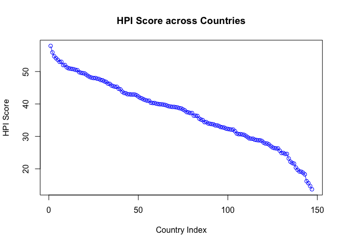
This code generates a line plot of GDP values for each country in the dataset.
Example 2: Scatter Plot
# Scatter plot of Life Expectancy vs HPI Score
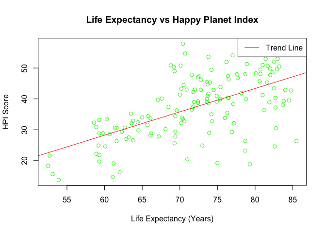
plot(hp_data$`Life expectancy (Years)`, hp_data$`HPI score`,
     xlab = "Life Expectancy (Years)",
     ylab = "HPI Score",
     main = "Life Expectancy vs Happy Planet Index",
     col = "green")

# Add a trend line
abline(lm(hp_data$`HPI score` ~ hp_data$`Life expectancy (Years)`), col = "red")

# Add a legend
legend("topright", legend = "Trend Line", col = "red", lty = 1)
Example 3: Boxplot of HPI by Life Expectancy Range
# Create a new factor variable for Life Expectancy Ranges
hp_data$Life_Expectancy_Range <- cut(hp_data$`Life expectancy (Years)`,
                                       breaks = seq(60, 85, by = 5),
                                       include.lowest = TRUE,
                                       right = FALSE)

# Boxplot of HPI Score by Life Expectancy Range
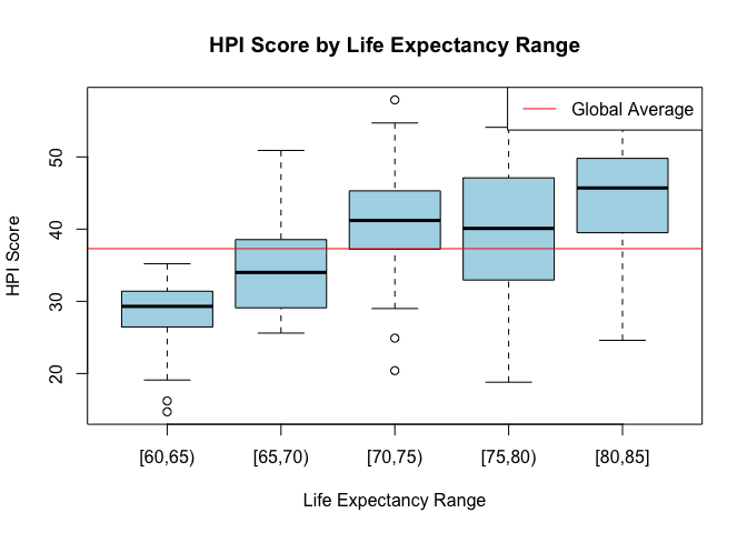
boxplot(`HPI score` ~ Life_Expectancy_Range, data = hp_data,
        xlab = "Life Expectancy Range",
        ylab = "HPI Score",
        main = "HPI Score by Life Expectancy Range",
        col = "lightblue")

# Add a horizontal line at the global average
abline(h = mean(hp_data$`HPI score`), col = "red")

# Add a legend
legend("topright", legend = "Global Average", col = "red", lty = 1)
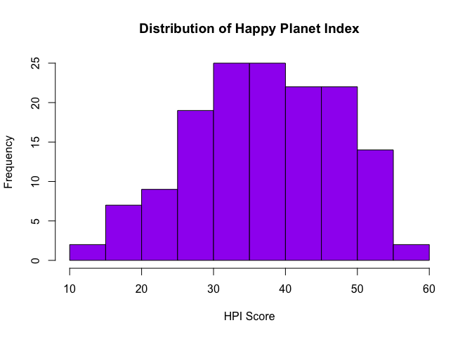
Example 4: Histogram of HPI
# Histogram of HPI scores
hist(hp_data$`HPI score`, col = "purple",
     xlab = "HPI Score",
     main = "Distribution of Happy Planet Index")
Example 5 Barplot of HPI
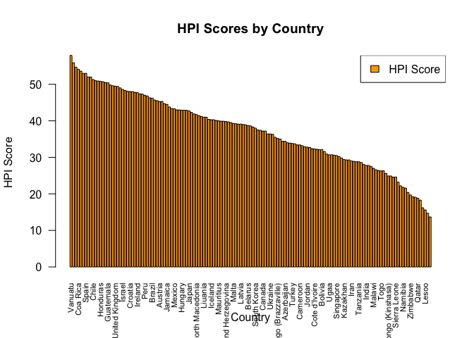
# Create a bar plot for HPI scores by Country
barplot(hp_data$`HPI score`, names.arg = hp_data$Country,
        col = "orange",
        xlab = "Country",
        ylab = "HPI Score",
        main = "HPI Scores by Country",
        las = 2,            # Rotate x-axis labels for better readability
        cex.names = 0.7)   # Adjust text size for better fit

# Add a legend
legend("topright", legend = "HPI Score", fill = "orange")
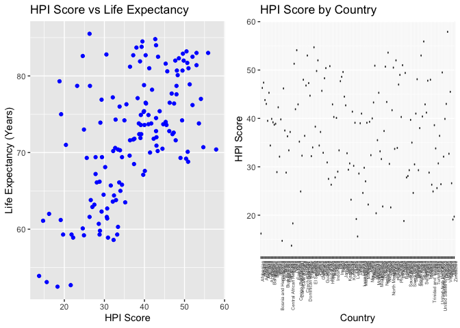
Example 6: GGPlot Plot of HPI and GDP
library(ggplot2)
library(gridExtra)

# Scatter plot: HPI Score vs Life Expectancy
p1 <- ggplot(hp_data, aes(x = `HPI score`, y = `Life expectancy (Years)`)) +
  geom_point(color = "blue") +
  ggtitle("HPI Score vs Life Expectancy") +
  xlab("HPI Score") +
  ylab("Life Expectancy (Years)")

# Boxplot: HPI Score by Country
p2 <- ggplot(hp_data, aes(x = Country, y = `HPI score`)) +
  geom_boxplot(fill = "lightblue") +
  ggtitle("HPI Score by Country") +
  xlab("Country") +
  ylab("HPI Score") +
  theme(axis.text.x = element_text(angle = 90, hjust = 1, size = 5))  # Rotate x-axis labels for better readability

# Arrange the plots in a grid layout
grid.arrange(p1, p2, nrow = 1)
Conclusion
I used HappyPlotIndex and various function’s from Paul Murrell’s R Graphics to create a variety of plots.
Enjoy Reading This Article?
Here are some more articles you might like to read next: