Assignment 5
Assignment 5
Import Dataset and packages
# Load required packages
library(readxl)
library(ggplot2)
library(dplyr)
##
## Attaching package: 'dplyr'

## The following objects are masked from 'package:stats':
##
##     filter, lag

## The following objects are masked from 'package:base':
##
##     intersect, setdiff, setequal, union
# Load the HPI 2021 data
hpi_data <- read_excel("HPI2021.xlsx")
hpi_data <- as.data.frame(hpi_data)
head(hpi_data)
##   Rank     Country Life expectancy (Years) Wellbeing Carbon footprint (tCO2e)
## 1    1     Vanuatu                    70.4       7.1                     2.62
## 2    2      Sweden                    83.0       7.4                     8.70
## 3    3 El Salvador                    70.7       6.4                     2.03
## 4    4    Coa Rica                    77.0       6.4                     4.37
## 5    5   Nicaragua                    73.8       6.1                     2.61
## 6    6     Denmark                    81.4       7.7                    10.04
##   HPI score
## 1      57.9
## 2      55.9
## 3      54.7
## 4      54.1
## 5      53.6
## 6      53.0
# Sort by HPI Score in descending order
hpi_sorted <- hpi_data %>% arrange(desc(`HPI score`))

# Subset the top 10 and bottom 10 countries
hpi_top10 <- hpi_sorted %>% slice(1:10) # Top 10 countries
hpi_bottom10 <- hpi_sorted %>% slice((n() - 9):n()) # Bottom 10 countries

# Combine top 10 and bottom 10 into one dataframe
hpi_combined <- bind_rows(hpi_top10, hpi_bottom10)

# Custom grey-to-red palette
colors <- colorRampPalette(c("grey", "red"))(10)

# General font settings
par(family = "serif", cex.main = 1.5, cex.lab = 1.2, cex.axis = 1)
Base R Graphics with Grey-Red Palette
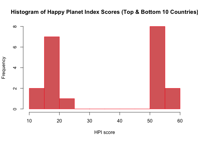
a. Histogram of the ‘Happy Planet Index’ (HPI score)
hist(hpi_combined$`HPI score`,
     main = "Histogram of Happy Planet Index Scores (Top & Bottom 10 Countries)",
     xlab = "HPI score",
     col = colors[5],
     border = colors[9],
     breaks = 10)
b(i). Vertical Bar Chart for ‘Country’
barplot(table(hpi_combined$Country),
        main = "Horizontal Bar Chart of Countries (Top & Bottom 10 HPI scores)",
        col = colors[3],
        xlab = "Frequency",
        horiz = TRUE,
        las = 1)

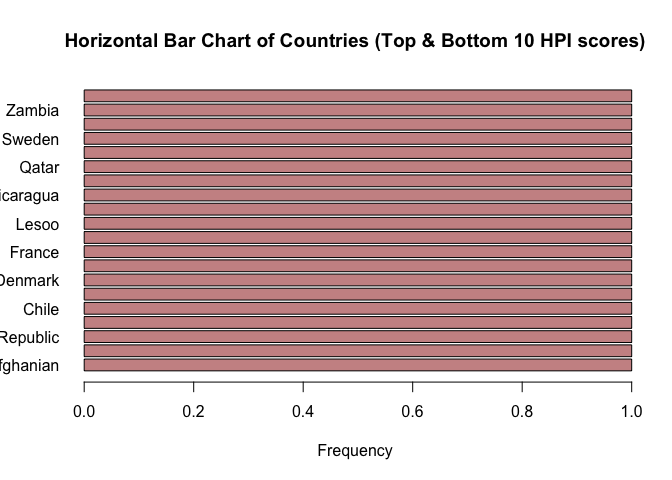
b(ii). Horizontal Bar Chart for ‘Country’
barplot(table(hpi_combined$Country),
        main = "Horizontal Bar Chart of Countries (Top & Bottom 10 HPI scores)",
        col = colors[3],
        xlab = "Frequency",
        horiz = TRUE,
        las = 1)
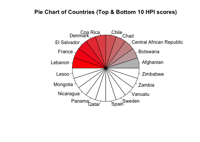
c. Pie Chart for the distribution of Countrys
country_counts <- table(hpi_combined$Country)
pie(country_counts,
    main = "Pie Chart of Countries (Top & Bottom 10 HPI scores)",
    col = colors[1:length(country_counts)],
    radius = 0.8)
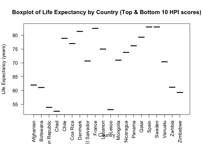
d. Boxplot of Life Expectancy by Country
boxplot(hpi_combined$`Life expectancy (Years)` ~ hpi_combined$Country,
        main = "Boxplot of Life Expectancy by Country (Top & Bottom 10 HPI scores)",
        xlab = "Country",
        ylab = "Life Expectancy (years)",
        col = colors[6],
        las = 2)
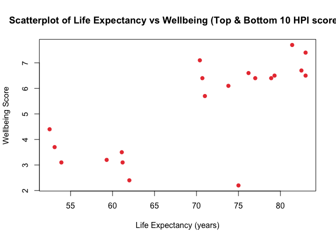
e. Scatterplot: Life Expectancy vs Wellbeing
plot(hpi_combined$`Life expectancy (Years)`, hpi_combined$Wellbeing,
     main = "Scatterplot of Life Expectancy vs Wellbeing (Top & Bottom 10 HPI scores)",
     xlab = "Life Expectancy (years)",
     ylab = "Wellbeing Score",
     pch = 19,
     col = colors[7])
Part 2: Use ggplot2 for Enhanced Visualizations
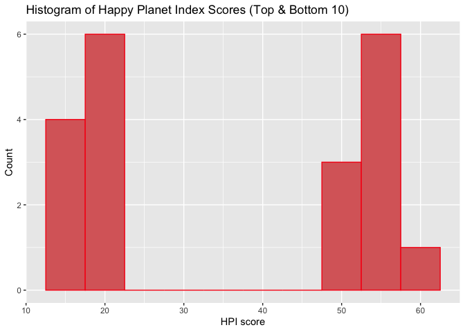
a. Histogram of ‘HPI’ (Happy Planet Index Score)
ggplot(hpi_combined, aes(x = `HPI score`)) +
  geom_histogram(binwidth = 5, fill = colors[5], color = colors[9]) +
  ggtitle("Histogram of Happy Planet Index Scores (Top & Bottom 10)") +
  xlab("HPI score") + ylab("Count")
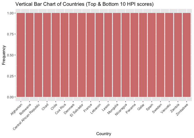
b(i). Vertical Bar Chart for ‘Country’
ggplot(hpi_combined, aes(x = Country)) +
  geom_bar(fill = colors[4]) +
  ggtitle("Vertical Bar Chart of Countries (Top & Bottom 10 HPI scores)") +
  ylab("Frequency") + theme(axis.text.x = element_text(angle = 45, hjust = 1))
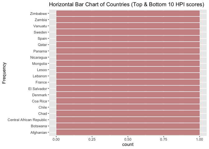
b(ii). Horizontal Bar Chart for ‘Country’
ggplot(hpi_combined, aes(x = Country)) +
  geom_bar(fill = colors[3]) +
  coord_flip() +
  ggtitle("Horizontal Bar Chart of Countries (Top & Bottom 10 HPI scores)") +
  xlab("Frequency")
c. Pie Chart for the distribution of Countrys
ggplot(hpi_combined, aes(x = "", fill = Country)) +
  geom_bar(width = 1) +
  coord_polar(theta = "y") +
  ggtitle("Pie Chart of Countries (Top & Bottom 10 HPI scores)") +
  scale_fill_manual(values = colors[1:length(country_counts)]) +
  theme_void()
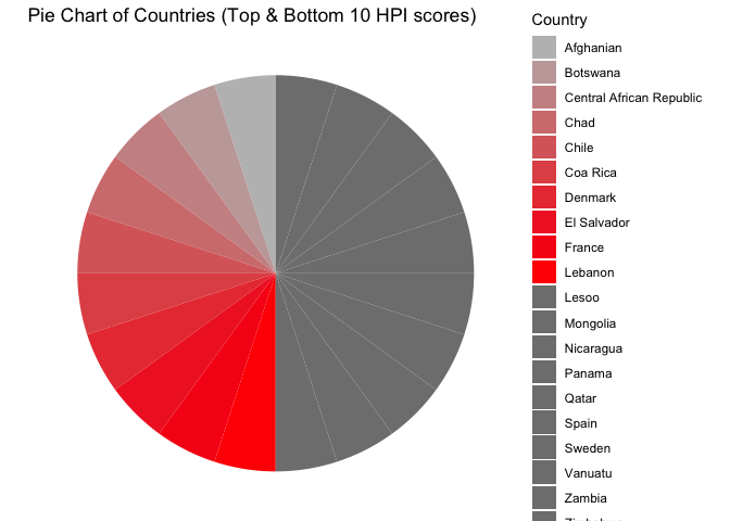
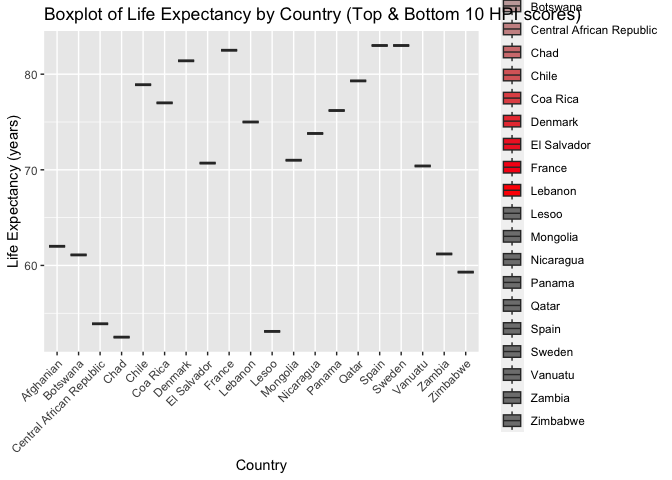
d. Boxplot of Life Expectancy by Country
ggplot(hpi_combined, aes(x = Country, y = `Life expectancy (Years)`, fill = Country)) +
  geom_boxplot() +
  ggtitle("Boxplot of Life Expectancy by Country (Top & Bottom 10 HPI scores)") +
  xlab("Country") + ylab("Life Expectancy (years)") +
  scale_fill_manual(values = colors[1:length(country_counts)]) +
  theme(axis.text.x = element_text(angle = 45, hjust = 1))
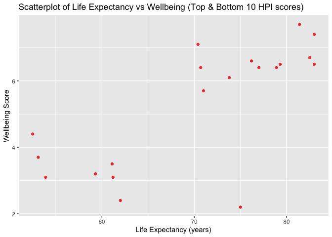
e. Scatterplot: Life Expectancy vs Wellbeing
ggplot(hpi_combined, aes(x = `Life expectancy (Years)`, y = Wellbeing)) +
  geom_point(color = colors[7]) +
  ggtitle("Scatterplot of Life Expectancy vs Wellbeing (Top & Bottom 10 HPI scores)") +
  xlab("Life Expectancy (years)") + ylab("Wellbeing Score")
Part 3: Exporting Charts
a. PDF Export
pdf("histogram_hpi_hpi_combined.pdf")
hist(hpi_combined$`HPI score`,
     main = "Histogram of Happy Planet Index Scores (Top & Bottom 10)",
     xlab = "HPI score",
     col = colors[5],
     border = colors[9],
     breaks = 10)
dev.off()
## quartz_off_screen
##                 2
b. JPG Export
jpeg("barchart_country_vertical_hpi_combined.jpg")
barplot(table(hpi_combined$Country),
        main = "Vertical Bar Chart of Countries (Top & Bottom 10 HPI scores)",
        col = colors[4],
        ylab = "Frequency",
        las = 2)
dev.off()
## quartz_off_screen
##                 2
c. SVG Export
svg("piechart_country_hpi_combined.svg")
country_counts <- table(hpi_combined$Country)
pie(country_counts,
    main = "Pie Chart of Countries (Top & Bottom 10 HPI scores)",
    col = colors[1:length(country_counts)],
    radius = 0.8)
dev.off()
## quartz_off_screen
##                 2
d. TIFF Export
tiff("boxplot_life_expectancy_hpi_combined.tiff")
boxplot(hpi_combined$`Life expectancy (Years)` ~ hpi_combined$Country,
        main = "Boxplot of Life Expectancy by Country (Top & Bottom 10 HPI scores)",
        xlab = "Country",
        ylab = "Life Expectancy (years)",
        col = colors[6],
        las = 2)
dev.off()
## quartz_off_screen
##                 2
e. BMP Export
bmp("scatterplot_life_wellbeing_hpi_combined.bmp")
plot(hpi_combined$`Life expectancy (Years)`, hpi_combined$Wellbeing,
     main = "Scatterplot of Life Expectancy vs Wellbeing (Top & Bottom 10 HPI scores)",
     xlab = "Life Expectancy (years)",
     ylab = "Wellbeing Score",
     pch = 19,
     col = colors[7])
dev.off()
## quartz_off_screen
##                 2

I noticed throughout the file sizes that the PDF file was the largest, followed by the TIFF file. The BMP file was the smallest in size. The SVG file was the second smallest in size. The JPG file was the third smallest in size. Also there is a possibility to adjust even more things within the document but for simply displaying the data, this is sufficient.
Enjoy Reading This Article?
Here are some more articles you might like to read next: